Everyone in the class was given a task of creating a business letter, sending them out, and contacting a business to work with and create designs for. I and another classmate took a different route, we were asked to create the school's band video. A massive project of all the band video's throughout the year and create a DVD, along with designing a DVD cover for it. This is still an on-going project and not yet completed but I'm excited to work on it and design a cover for the DVD case because the cover from last year is not very good, so my classmate and I plan to make it a lot better.
Bis dann (Until then)
Monday, December 3, 2012
Yearbook Covers
Last week, we were given probably the most annoying project I could've thought possible. I made it through my creativity block just to stumble again. Our project....yearbook covers for the school. We had almost no rules for this project besides that it must obviously make it school related and to have, "Every Ending Is A New Beginning" on it.
The school's mascot is 'the black tigers' so what I did for both of my covers was put tigers on them, trying to make it in a unique way....but how creative can you get with a school yearbook? For my first design, I wanted to stay true to my brand identity. So I found a cool picture of a tiger and used threshold on it, then filling in all of the white with the school's color of yellow. The font was the harder part. I'm still not 100% crazy about the way I have the fonts, it was hard to put two long sayings, "The Cuyahogan" and "Every Ending Is A New Beginning" on one small cover.
For my second design, I used another tiger (Natürlich) but in this photo I just used the sides of the tiger and wrote 'The Cuyahogan" down the middle where there wasn't the image of the tiger. After that, I just adjusted image settings to it, to give it more of a glow and to bring out the oranges.


Wednesday, November 21, 2012
Black Friday
In less than two days, the day that workers dread and shoppers crave is here....Black Friday! The biggest shopping/marketing day of the entire year, where thousands of people crowd into stores such as Wal-Mart, Target, Apple, ect. to get their Christmas shopping completed at a low cost.
The term "Black Friday" originated from a marketing stand point, where a store is once again 'out of the red' meaning, a store usually spends more than it makes in profit, putting it in a 'red' category, which is bad! So on this huge shopping day, with low prices and tons of promos, businesses usually all return to a 'black category, returning all of their profit.
Every year people camp out or create massive lines outside of stores waiting to be the first to get amazing deals. But things are going to be a little different this year, Forbes recommends three useful tips and changes happening in this years Black Friday. 1, "Consumers Crave Mobility", this meaning each year, the number of online Black Friday shoppers has increased by 371 percent, so having an online option is always important. 2, "Customers Want "Couch Commerce" again, about an online option, more than 50 million Americans visited an online retail site on Black Friday. And by this it drove $816 million in online sales alone. And 3, "Success Centers On The Customer Experience", working in retail myself, this is always a big saying that is pushed. Workers need to communicate with customers with promos and make sure you can show them the best product available to them and their needs.
This year is going to be a little different for big stores such as Wal-Mart and Target, with a new opening time of 9:00 (21:00) on Thanksgiving day and each store will have special items that will be sold at a low price. This year, I will not be taking part in Black Friday because like most retail workers on Black Friday, I have to work. Fun...not.

Friday, November 2, 2012
Business Letter

Monday, October 22, 2012
Logo Design

What I finally came up with was to use a picture I took while in Salzburg, Austria (Österreich). I decided to do this because I love Europe (Especially Deutschland and Österreich) and along with that, I love lots of design. It's hard for me to create a small piece of work.
What I did with the original photo to make it a bit more interesting was created several layers on Photoshop and made every layer different somehow, using a lot of gradient tools. I made about 22 layers, all the same photo but using a lot of different color tools and items for saturation, ect. Overall, I'm happy with the ending result. I used a photo that I took while traveling and just made it more appealing.
My next logo was again, hard. I had to create one for another student in our class. He told me he liked things simple, earthy colors, and skinny fonts. For a designer who loves LOTS of design, this was difficult. I sat on Google Images looking at earthy tones and other things I could use for this. Then it hit me, It was semi-unrelated to what he wanted but I knew that he bmxed.

Until next time,
Monday, October 8, 2012
Carrots, Carrots and More Carrots!
Did you ever think you'd hear that baby carrots could be considered junk food? My first reaction to this was, of course, "No way..." But after reading the article, "How Carrots Became The New Junk Food". It became a little more clear to me...
Carrots aren't really considered junk food (thank goodness), It was the way they were/are advertised. But it all started in the 1990's when baby carrots were invented. A local farmer named Mike Yurosek, was frustrated with the waste of carrots. Supermarkets expected carrots to be a particular size, shape, and color. Anything else had to be sold for juice or processing or animal feed, or just thrown away. So what Mike did was interesting and became a big hit. He just peeled a 'gross' part of a carrot, cut them in half and put them in bags for a few test batches to show customers.
Baby carrots became a huge hit! Farmers began to plant fields with baby carrots in mind. This became a big deal, the thing no one expected, was that baby carrots seemed to make Americans eat more carrots. In the decade after they were introduced, carrot consumption doubled in the United States.
On a different note, Jeff Dunn became the new CEO of Coca-Cola, but three years before that, he was CEO of Bolthouse Farms. Dunn later put together a series surveys and discovered something interesting. People said they were eating as many carrots as they always had. But the numbers clearly showed they were buying fewer. It turned out, people were likely to keep carrots in the fridge. When the recession hit, though, people were more likely to buy regular carrots, instead of baby carrots, to save money. And unlike baby carrots, which dry out pretty quickly once a bag is opened, regular carrots keep a long time. So people were buying regular carrots and then not eating them, and not buying more until the carrots they had were finally gone or rotten.
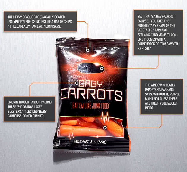
The Bolthouse comapny had never marketed its baby carrots. It just sent truckloads to stores, where they got piled up in the produce aisle. Dunn, then assembled a small team and studied advertising campaigns for agricultural products. So then, Dunn and his team began to think of ideas of how to market carrots in an interesting way.
They later all met for a conference in Colorado about how to market a carrot in an interesting way, "To have a great advertising idea, you have to get at the truth of the product," Farhang explains. "The truth about baby carrots is they possess many of the defining characteristics of our favorite junk food. They're neon orange, they're crunchy, they're dippable, they're kind of addictive." So thats what they decided to do...market carrots like junk food.
 How they imagined to do this was to individually package the carrots in a crinkly plastic, like potato-chips, and have bold junk food graphics on the packaging. It's a bit funny to think that we need to market carrots, a healthy vegetable, like it's a junk food so people will buy it. This, to me, is a little ridiculous. Only in America, the fattest county in the world, do we have to market something healthy as a junk food so people will buy it....
They later all met for a conference in Colorado about how to market a carrot in an interesting way, "To have a great advertising idea, you have to get at the truth of the product," Farhang explains. "The truth about baby carrots is they possess many of the defining characteristics of our favorite junk food. They're neon orange, they're crunchy, they're dippable, they're kind of addictive." So thats what they decided to do...market carrots like junk food.
Friday, October 5, 2012
My Thank You Card Design
Last week in my Interactive Media class, we were given the project of designing a thank you card. At first, I thought this project was pretty hard, thank you cards have to be simple yet convey some type of message.
My first thought was to do some type of black and white photography as my main background (I love full designs). First I tried to look for some type of city for the background, but my search ended in a fail. But I kept searching for black and white photos. So my next move was to head to Stumble Upon and search photography. I found interesting photos, one of a cup and another of a bmxer.
At first my thought was to use the bmx photo I found because I bmx in my free time. :) But then, I thought...."what does this really have to do with saying thank you?" So again, my idea changed. I kept Stumbling and then I stumbled on a photo of a dandelion. Then all the ideas hit me.
The idea that hit me was a popular tattoo design but I wanted to make it a bit different. I happened to design exactly what I thought of. It's simple but also exotic. The picture I used was a hand holding a dandelion, but instead of the normal dandelion seeds coming from it, I used birds.
I'm very happy with my thank you card, but I'm also thankful that I sit next to someone who can help me with this program!

Monday, October 1, 2012
Olympic Sponsors!

Social Media is the leading cause to why the 2012 London Olympic is protecting it's sponsors. Sponsorship is a huge business, which has already raised up to $957 million!
When sponsorships meet social standards, fans can be punished (according to the ticket purchase) for taking photos or videos and uploading them to a social media site. As well as the athletes, they are not allowed to comment on another competitors performance or promote a brand using social media.
With social media making it easier for unofficial brands to attain success from international events, it stands to question, "Are sponsorships even worth it anymore?" The Journal of Managing and Marketing Research found that sponsor-event fit and brand equity are the most important factors when measuring the long-term financial success of brand sponsors. This is true when it comes to high-profile events like the Olympics, which has been considered the 'holy grail' for brands. These events usually have a “halo effect” in which, brand sponsors feed off of good-vibes.
Three ways social media is harming brand sponsors is that a brand can not control what someone says about a brand through social media, nearly a billion people use Facebook, 140 million on Twitter, and 18 percent of the world owning smartphones , the IOC’s (International Olympic Committee) efforts may be too late. IOC social media chief, Alex Huot warns that mechanisms are the case of online copyright infringement, but he acknowledges the impossibility of monitoring every tweet and webpage.
My own opinion on this topic is that, I believe that sponsors should be kept. I think it's something every athlete strives for. On a more personal note, I recently started bmx, this is a very underrated sport. Truly one I believe is harder than any sport I've ever played. But to stay with a sport and become good enough that you (the athlete) gets sponsored is, I'm sure a tremendous feeling of joy. You worked so hard to accomplish something great and a brand recognized that. So I strongly believe brands should stick around for athletes.
Friday, September 28, 2012
Student In Marketing
I've been in a Graphic Design and Marketing class for about six weeks now. This whole experience, driving 30 minutes away from my home town to take this class, is of course, killing the gas in my car. But this experience is one that I will cherish as a young designer.
The point of this blog is to write all of the experiences and projects that we've worked on throughout these six weeks. The first project we were given from our Marketing teacher was to set up a professional e-mail account. So when we contact clients we can look more professional than having our everyday e-mail. Then project number two came from our Graphic Design teacher, to create a business card, for ourselves and a client. This was a little challenging, creating this business card, was only the second time I've ever used Photoshop in my life. Luckily, I was sitting next to an experienced user in Photoshop, she certainly helped me through this difficult program.
My client....he was a strange one. At first he wanted his business card to be red with clouds and his font color yellow. First thing I did was find a picture of clouds, then on Photoshop, I colored the background red. I thought I was doing great on his business card....then he wanted his photo on it. Then I hated it. It looked unprofessional, I met with him again and we decided to redesign the entire thing. I then made the business card more professional looking without clouds and his photo. We were both happy with the end result. My business card had a cherry blossom tree faded in the background with all of my information on the branches of the trees. I was happy with this overall assignment and think they both turned out well.
Our new assignment we'll be working on soon, this will be finding a toy from our childhood and putting it in a background to make it look like this toy is doing some kind of action. I'm looking forward to this but I'm also not. Finding a toy will be pretty tough.
I'll update more on what's to come for this class. :)
Subscribe to:
Comments (Atom)